I actually had to do this for a final exam.
The guidelines were to make a web banner ad for season 2 of One Punch Man.
My process on it was, overall, pretty simple. I wanted the title text large and “breaking the border.” Wanted a close-up of the main characters face in a sort of mid-action pose, and have some form of destruction, explosion, something going on in the background to keep it interesting.
Another thing that I wanted, that took a good portion of time getting “just right,” was to emulate the issue number found on the manga to denote that it is for season 2. Here’s what that ended up looking like:
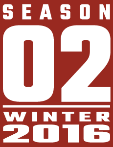
It might not look like much, but when you’re dealing with mimic’ing the style and feel of something in completely different language and with a lot less words, it takes a bit to make it feel just right. This part was done purely in Illustrator.
Otherwise… The rest was pretty straightforward to accomplish what I wanted to do. I found, cleaned and colored a piece of art for the main character, ran a photo of a wildfire under a few filters in photoshop and placed it as a background, and finally recreated the logo and tagline for one of the outlets that would actually offer the product.
Here’s the completed ad:
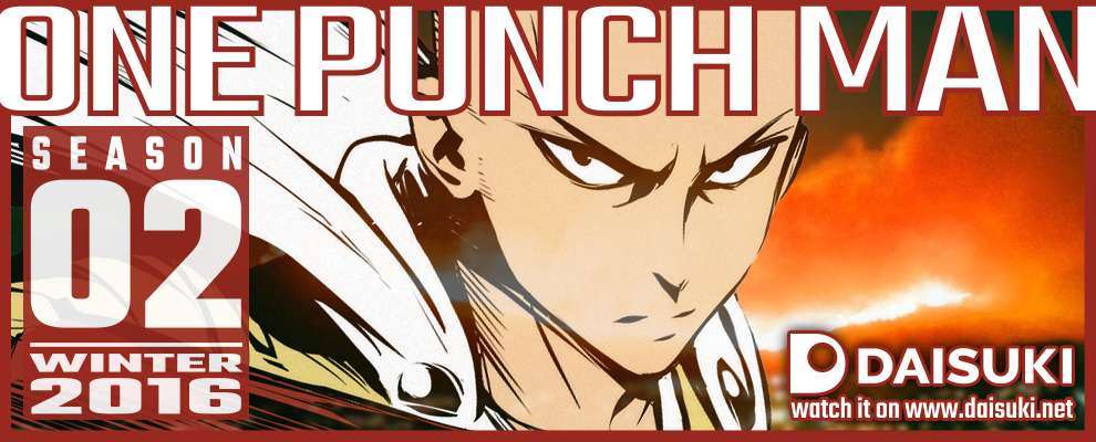
The text, border, logo and season 2 card were all done in Illustrator, with the background, character art and other finishing touches all handled in Photoshop.
Solid banner