This was a fun project.
The assignment was to take a quote and use it as a driving force of an advertisement through emphasis typography.
“Designs of purely arbitrary nature cannot be expected to last long.” – Kenzo Tange
The quote I ended up using(the one directly above), was from an architect who was known for modernism and was heralded in some circles as one of the starting factors in brutalism. He gave this particular quote while receiving the Pritzker Prize in 1987, which made the choice of “who to advertise for” a pretty easy one.
The ideas behind my design choices were all pretty straightforward. Since the quote was from an architect, using buildings, structure, etc. became the top theme. So of course, I broke the quote into proper segments and made building shapes out of them. Makes sense right? There was a good bit more to it, though. The buildings had to mimic something that follows the quote. Long standing buildings. So that’s what I did.
For reference, here is the initial vectored version of the plain text and top banner:
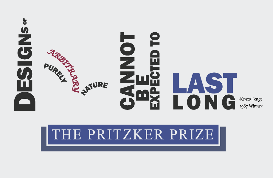
From left to right, the buildings modeled were as follows: The Empire State Building, The Sydney Opera House and the Tokyo Metropolitan Government Building(a building Tange actually designed). The “last long” building hadn’t actually been given much detail or plan at this point of the design stage, so it’s just in a cliche way.
That wasn’t all there was to the project, though. There was advertising to be planned and placed. There were filters to be used. There were final touches to add. While I’ll admit I do prefer doing things very cleanly, having pure text on a plain background can be pretty boring. And you can’t really have an advertisement piece be “boring.”
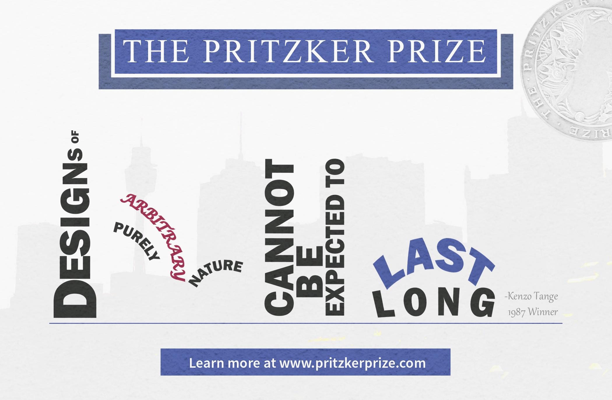
This was how the final, post-photoshop version came out:
Big difference, right?
First, the “last long” portion was made to attempt to mimic the Cincinnati Union Terminal. It’s a pretty iconic building, I hear the Hall of Justice was designed after it. It’s also a local thing so I figured it would be nice to at least attempt to incorporate.
Second, there’s a texture that’s placed on top of the whole thing. It’s noticeable on the primary text and the background, but it really, really pops on anything blue. The texture used is literally a photo of dry wall, so even the texture is vaguely architectural to keep up with the theme.
You’ll also notice the skyline in the background. To be honest, there wasn’t really too much thought or anything “neat” put into that. It’s a photo of the skyline belonging to Sydney, Australia. And other than the Sydney Opera House, there isn’t really anything connecting it other than this specific photo having the orientation and contrast that I wanted. But sometimes that’s enough reason to use something.
Finally, you have the Pritzker Prize medal in the upper right. There isn’t too much special here. The only truly deliberate design choices were to 1. Make it look as much like a watermark/imprint as possible and 2. I wanted all three words, “The Pritzker Prize” to be visible, or at least visible enough to be auto-completed when read. Goal #1 was met through application of filters and layering, and goal #2 was met through rotation and positioning.
Overall, I’m pretty content with how the project turned out. Type is probably one of the things I have the hardest time with, so this was decently challenging to get through.