This was a project where I had to take a pre-existing, albeit discontinued(and nationally banned in the US), product and make an attempt to repurpose and rebrand it, and create both a print and web ad for the product.
The original product was “Jarts,” a lawn dart variant.
My idea? A mobile electric fence kit.
As far as the design portion goes, I decided to keep the original old-school look and feel but update it to look a bit more modern. What this meant was a basic color palette, simple lines and very specific font styles.
First step of the process was getting a concrete logo set into place. This is what I ended up with:

Really simple, very similar to the original but updated to purpose. The yellow gradient was put into place to tie the “electric” into the logo and to denote that the top end of the J belonged to the word “electric.” I also pulled the yellow into the dart itself to give it a better highlight and to help solidify the palette.
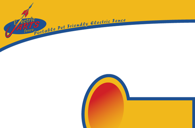
The next step? Design the layout of the ads and create them in illustrator. Here’s where that ended up.
Print:
Web:
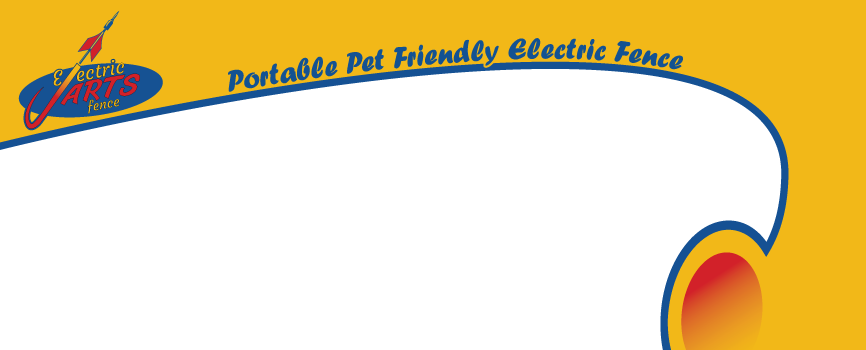
As you can tell, I pushed the palette pretty hard. The yellow used as a baseline to pull attention, the blue for outlines and the type and then using the red as a highlight element.
Pretty basic stuff. From there it was straight to photoshop to place in the rest of the content and finish the piece.
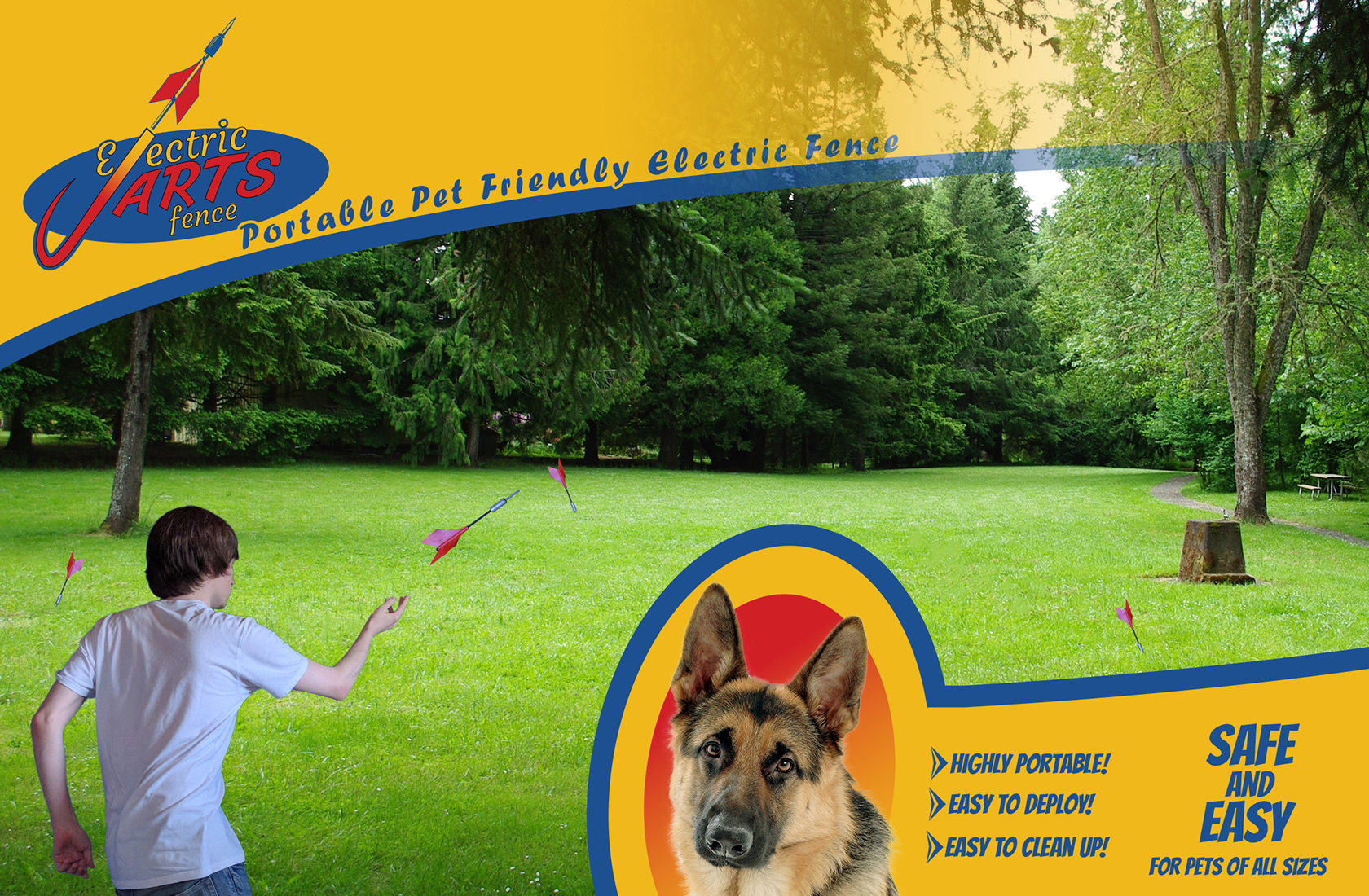
Here are the final revisions of the ad:
Print:
Web:
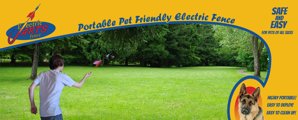
I’m a bit mixed on how it turned out. I feel like the template design, the type, the colors, everything in that area turned out fantastic. But the photo content I’m not quite as stellar on, simply because I felt like I had to compromise a bit due to limited photo availability.