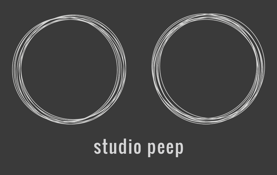
If you’ve seen my actual website, you’ve probably noticed a heavy use of a set of squigly looking circles. Well, that set of squigly looking circles happens to be my logo. It’s basic, it’s pretty minimal and I like it. A lot of people also seem to find it pretty interesting, so that’s great too, right? But what those people don’t know is that there was a good amount of agonizing time spent in coming up with that set of basic, minimal squigly looking circles.
This whole process started a decent while ago. One of my first digital media classes, for a project the class had to create a logo for themselves. Sounds pretty basic, right? Hah. Yeah.
Anyway, here’s the thing. My name, while part of it is a bit on the interesting side, doesn’t really lend itself very well to design around. And while using initials is an option, I’ve never really identified myself all too well with “LJW.” So I had to come up with some form of alias, or I guess a pen name would be a more apt description.
Before I go on explaining naming, here is an off-site gallery of a number of sketches produced for the project. I’d embed them here, but there’s way too many. A few of them should stick out like a sore thumb, but if you don’t entirely notice them due to poor image quality I’ll totally understand.
Now then, the naming. I had a lot of issues coming up with the naming. So I started where everyone probably would, I tried to figure out some defining characteristic of myself. So what did I come up with? Glasses. I wear glasses.
Yeah. Glasses. But it’s okay, there’s a lot of things to do with that. Glasses enable clear sight. They’re also a stereotypical characterization of someone with intelligence. But doing “just” glasses is also a little hard, so I diversified. I tried using various synonyms for sight, seeing or looking(and for glasses). Words like Specs, Spectacles, Frame(s). Even used the German word for glasses, Brille. None of those things really stuck.
Except one.
“Peep.” It’s simple. It’s symmetrical. It sounds “cute” when said on its own and even better it evokes a visual response. Well, it evoked a visual response for me, your mileage may vary.
This was the first iteration with the word. It should look a little familiar.
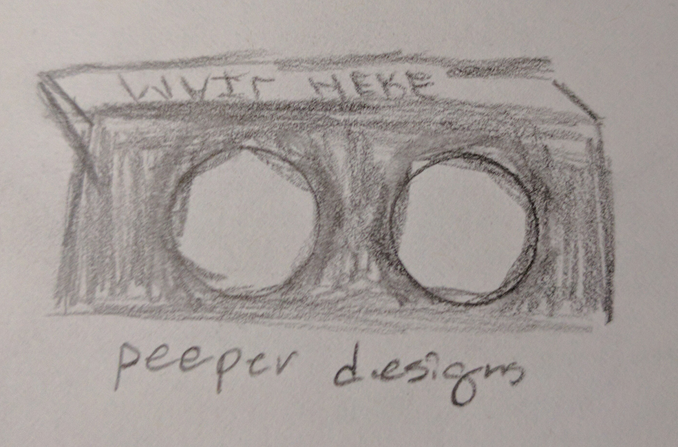
The name is off. And there’s a lot more surrounding it. But the two circles are there. And while it’s a pretty mediocre sketch with pencil, the idea – at least for me, was showing a pair of glowing eyes with a dark backdrop. Which incidentally, ended up heavily influencing my color palette choices.
That wasn’t the only design I worked on finalizing, though. There were two others, both influenced by the letter Z – taken from the last letter of my last name. I kind of fancied the “mysterious” approach. You know, like Mysterious Racer X. Just with a Z. It also helped with the minimalism/simplicity.
After finalizing everything down to three designs, it was time to take it into illustrator.
These are the final two designs for anything and everything dealing with the letter Z:

I personally like the one on the right more than the left, but the negative space of the left really draws attention to itself.
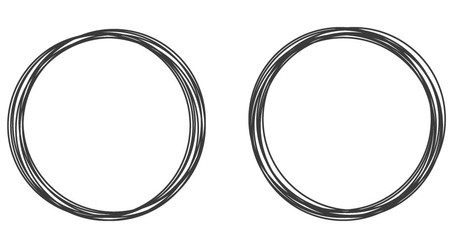
But those two designs had a competitor before I decided to start finalizing. And ultimately, the competitor won.
Here’s the competing “peep” logo:
I think the stroke used was a bit thick, but the idea itself was great. It’s simple. It’s minimal. And it draws a good amount of attention. But just vectoring wasn’t really all the work that went into finalizing the design.
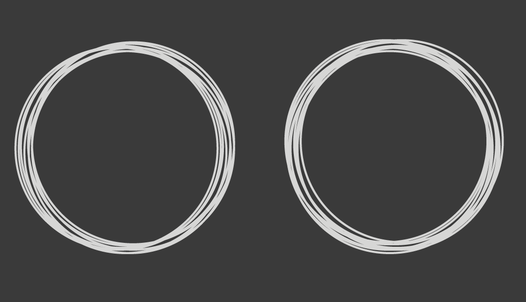
Something I kind of skipped over was the color palette. I sort of mentioned it earlier, but didn’t really delve into it. So here it is. I wanted a two-tone palette, and I wanted it to have a kind of embossed paper sort of feeling to it when both colors are used together, without any actual added effect. They also needed to read well off of each other. I knew from the start I wanted a dark background for the base, but I didn’t really know what to go with. So after playing around a bit, I ended up sort of… “finding” two colors that did exactly what I wanted. #3a3a3a and #d5d5d6.
Here they are in easy to reference format:
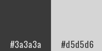
I’ve kind of used those colors for almost everything since. They’re just really effective colors. That wasn’t really all I had to do, though. I also had to find a font to fit the style. I also decided, that the name “Studio Peep” needed to stay entirely lower case for balance reasons. So whatever font I chose had to look great in lower case.
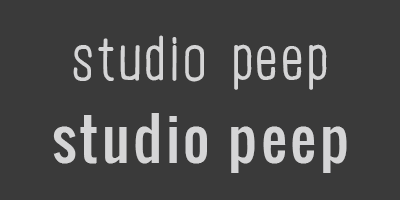
Originally, back at the onset of the whole thing, I had settled on a font called CF La belle Helene. But once I started doing actual web development work, that wasn’t very feasible due to web-font reasons. So, of course, that changed. Luckily for me, there happens to be a google font that has a very similar feeling, just a good bit cleaner and a bit bolder. So for now, I’m using a font called Oswald. And I have to say, I’m pretty content.
Here are the two fonts compared, the top being CF La belle Helene and the bottom being Oswald:
And all of that was a pretty basic walk-through of how my logo and name choice came to be. It’s pretty wordy but I hope it wasn’t all that boring. Thanks for reading, and if you’re interested in how I’m currently utilizing these assets, check my primary site at studiopeep.com.